Work / Thermonova
A rebrand that took aheat-pump makerinternational
From a brand that looked like every competitor to a premium identity and a multilingual site built for international growth.
- My role
- Art direction, Client management, Project management
- Delivered with
- Delivered with the Kvalifik team
- Year
- 2025
- Outcome
- Page views up 488% after launch
- Deliverables
- Positioning workshops · Logo and visual identity · Brand guide and assets · Multilingual Webflow site · Photography and 3D renders · Brochure
-
+488%
page views, six months before vs after launch
-
4
visual directions explored before the final one
Challenge
Thermonova builds high-performance industrial heat pumps in Aars, Denmark. The technology was strong, but the brand did not reflect it. The visuals looked like the competition: similar reds, generic fonts, a logo that did not stand out. The website was hard to navigate, not responsive, and only in Danish. That created friction for prospective customers and capped international growth.
Approach
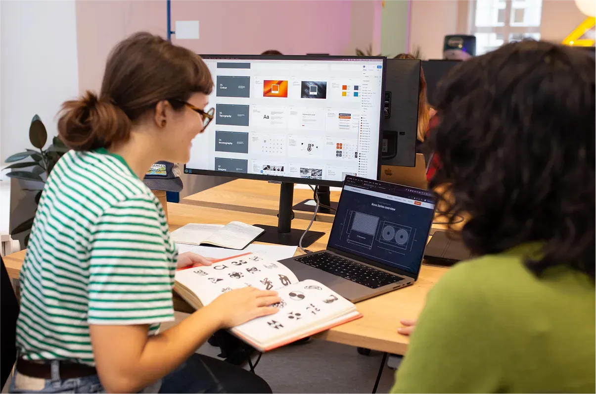
We started with collaborative workshops to align on positioning, purpose and values, reviewed the competitive landscape, and defined several visual directions before developing the chosen one through an iterative design process.
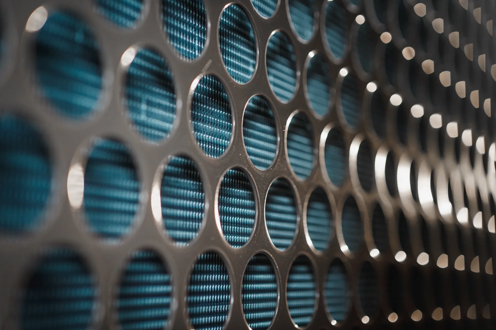
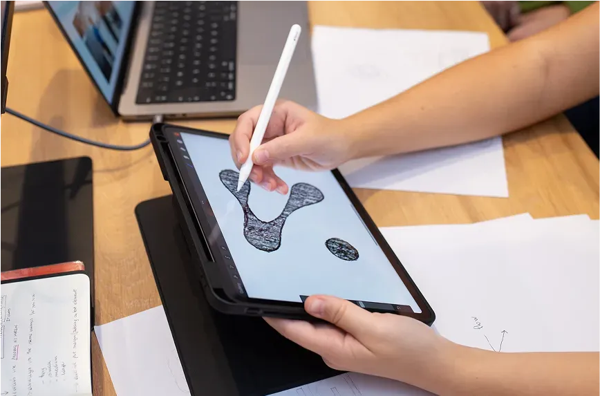
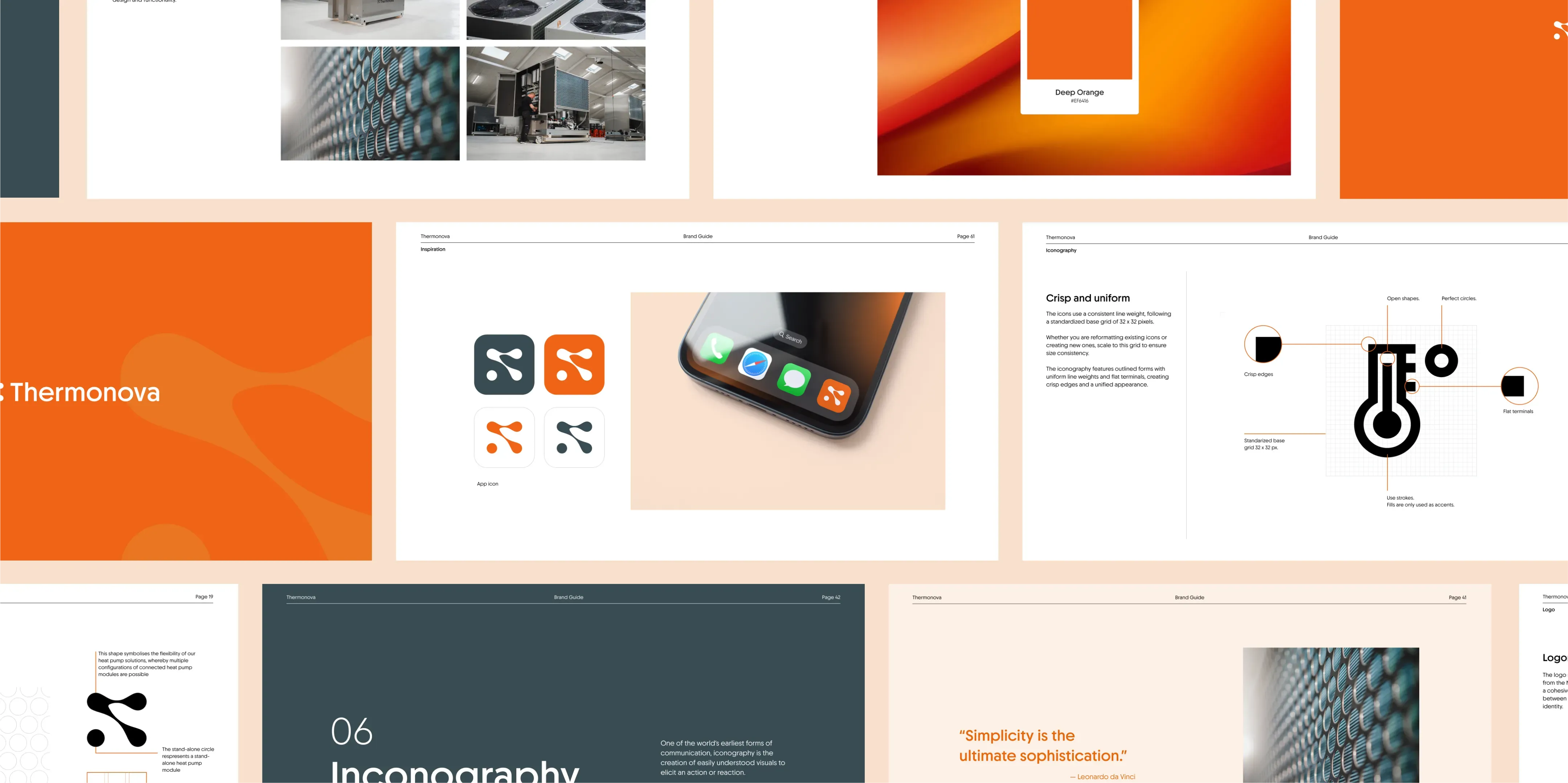
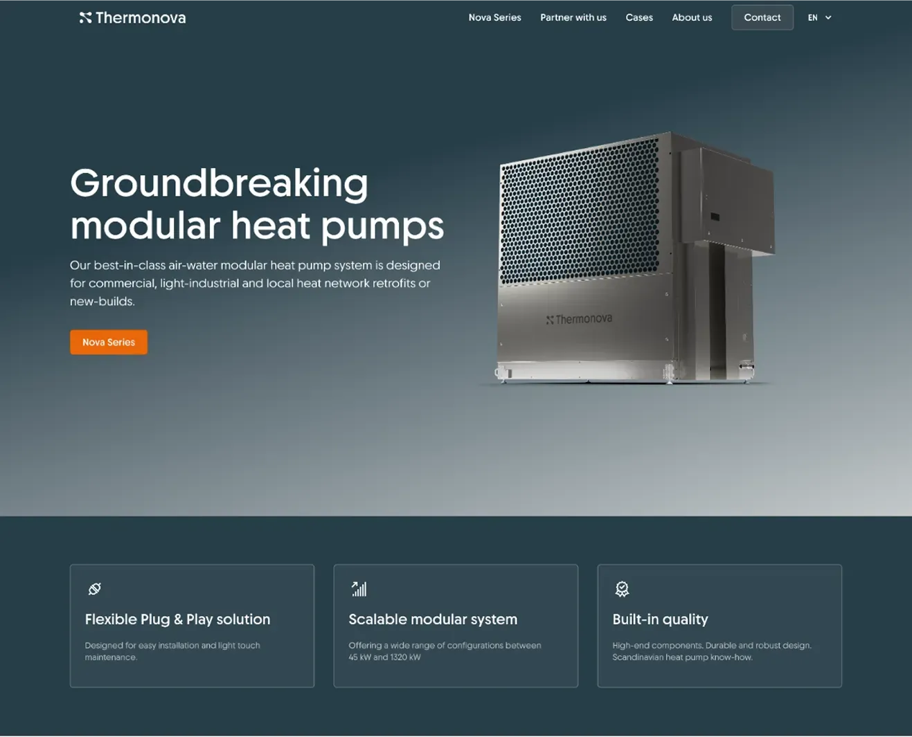
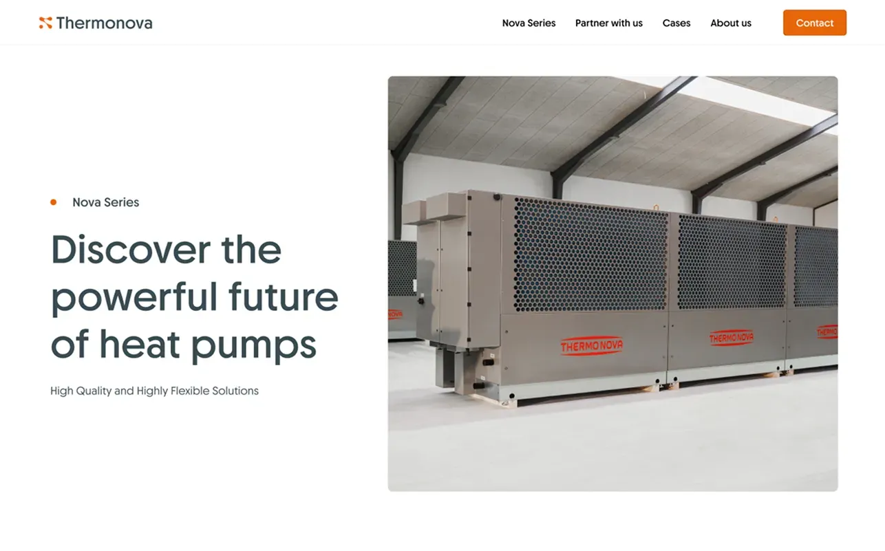
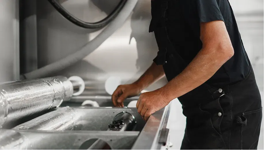
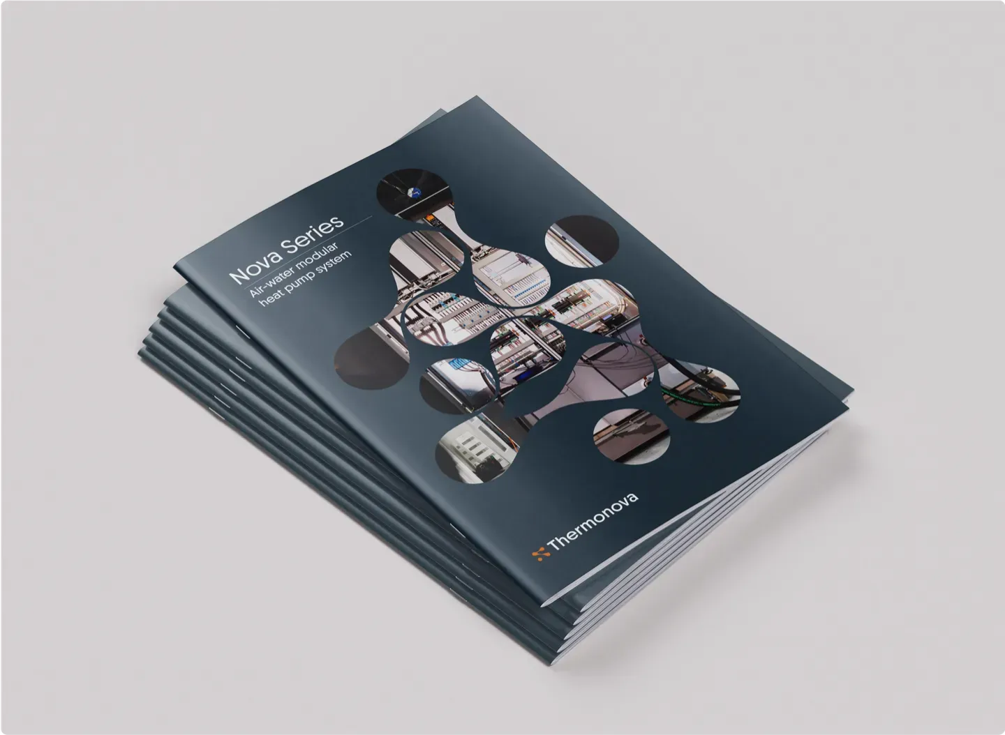
The new logo mark is derived from the product’s characteristic pattern. Its fluid form reflects the motion inside the machine and the modularity of the product. The identity was documented in a brand guide for consistency across platforms, and the new multilingual website was built in Webflow. Custom photography captured the craftsmanship in Aars, and the system extended to a brochure and 3D renders.
Outcome
Page views rose 488 percent comparing the six months before the launch with the six months after. More importantly, the rebrand strengthened credibility and positioned Thermonova as a premium player able to grow internationally.
“Friendly, proficient and responsive, Kvalifik's intellectually curious approach shines through.”